 Neuerscheinungen 2012Stand: 2020-01-07 |
Schnellsuche
ISBN/Stichwort/Autor
|
Herderstraße 10
10625 Berlin
Tel.: 030 315 714 16
Fax 030 315 714 14
info@buchspektrum.de |

Sofie Beier
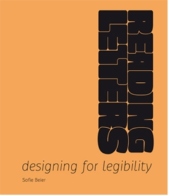
Reading Letters
Designing for Legibility
2012. 184 S. zahlr. farb.Abb. 25 cm
Verlag/Jahr: BIS PUBLISHERS 2012
ISBN: 9063692714 (9063692714)
Neue ISBN: 978-9063692711 (9789063692711)
Preis und Lieferzeit: Bitte klicken
This book will not only help type designers create high-legibility typefaces, but also help graphic designers determine the optimal typeface for a given project. Few of us will appreciate whether the typeface we read is legible, but we quickly notice if it is not. Creating type for optimal legibility is therefore an ungrateful task, since readers only register your failures. For instance, typefaces presented under difficult reading conditions, such as small font sizes in low-quality newspaper print, or street and building signs viewed from afar, need to be created in specific ways to function optimally. To understand the topic in depth, two very different areas of expertise have been consulted. One area is that of punch cutters and designers whose professional experience confers upon them useful knowledge that can help us better understand the various aspects of the matter; the other is that of academic reading research, a field in which a significant amount of relevant scientific studies have been carried out over the years. The outcome of this research has yet to be made widely available to designers. Consequently, many designers make assumptions without really knowing whether they are right or wrong. Reading Letters is a serious and engaging compilation of knowledge from the design and scientific communities, supplemented by visual examples of legibility. A must-have for type designers and graphic designers.
This book will not only help type designers create high-legibility typefaces, but also help graphic designers determine the optimal typeface for a given project. Few of us will appreciate whether the typeface we read is legible, but we quickly notice if it is not. Creating type for optimal legibility is therefore an ungrateful task, since readers only register your failures. For instance, typefaces presented under difficult reading conditions, such as small font sizes in low-quality newspaper print, or street and building signs viewed from afar, need to be created in specific ways to function optimally. To understand the topic in depth, two very different areas of expertise have been consulted. One area is that of punch cutters and designers whose professional experience confers upon them useful knowledge that can help us better understand the various aspects of the matter; the other is that of academic reading research, a field in which a significant amount of relevant scientific studies have been carried out over the years. The outcome of this research has yet to be made widely available to designers. Consequently, many designers make assumptions without really knowing whether they are right or wrong. Reading Letters is a serious and engaging compilation of knowledge from the design and scientific communities, supplemented by visual examples of legibility. A must-have for type designers and graphic designers. Sofie Beier is a research assistant professor employed at The Danish Design School. She has a PhD from the Royal College of Art in London in typeface familiarity and its relation to legibility.
"It gathers a lot of resources that I haven´t seen in print before - certainly not in a single volume. It´s as useful to typographers as it is to type designers and it will help any font user be more informed about how they select and set type." - Stephen Coles - Typeanatomy.com "Rather than infallible recipes, the book offers a series of considerations and assessments, helped by academic resources and practical examples, all carefully illustrated. Big names (Gerard Unger, Matthew Carter) sit alongside little-known studies such as Frank E. Blokland´s research on ´patternisation´ of type design." - Sébastien Morlighem - Eye "A comprehensive review of what we know about reading and legibility and how they relate to letterforms. I am a huge fan of this book and Sofie´s work." - Thomas Phinney


